-1
$\begingroup$

This image illustrates my question:
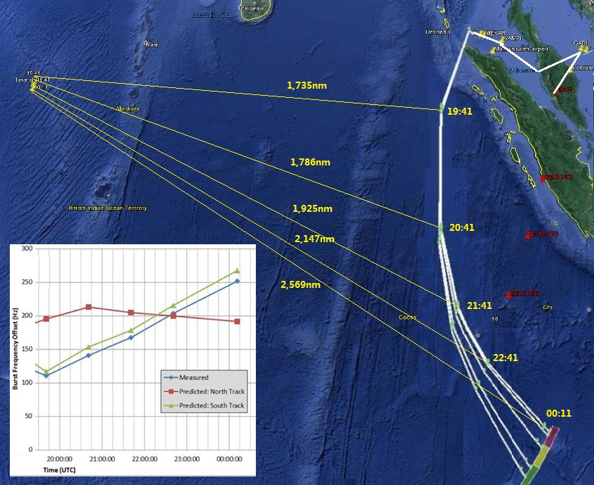
Satellite distance displacements

In the Burst Offset Frequency chart from 19:41 UTC until the final ping at 00:11 UTC the blue track for MH370 shows increasing frequency, which means flying towards the satellite.

Therefore for the Burst Offset Frequency chart to be correct the flight track in maps released by the preliminary accident report should have curved west not east.

If they were fundamentally so wrong how could this ping chart ever have been used to plot the final location of MH370?

$\endgroup$
4
  • 1
    $\begingroup$ The "frequency offset" is a Doppler-effect-derived value. It's related to the speed of the aircraft towards/away from the satellite, not its distance; the rising line is consistent with an aircraft slowly turning away from the satellite. (It's also consistent with the aircraft performing a number of more improbable maneuvers, which is why the chart is simply the most likely track.) $\endgroup$
    – Mark
    Commented May 17, 2014 at 8:30
  • $\begingroup$ If the BOF chart shows constantly increasing velocity towards the satellite, then the track distance should also reflect that. The problem is not my interpretation. The aircraft could not have flown the track suggested and give the offset frequency values reported. One or other is a lie and the lie is the official accident report's track which is a mere speculation. $\endgroup$
    – user2357
    Commented Jun 19, 2014 at 4:43
  • $\begingroup$ @user2357 The problem is your interpretation. You assume that an increasing velocity towards the satellite means decreasing distance towards the satellite. That is false. $\endgroup$
    – user2168
    Commented Jun 20, 2014 at 16:55
  • $\begingroup$ "You assume that an increasing velocity towards the satellite means decreasing distance towards the satellite. That is false." Why? If I run towards you with increasing velocity, my distance from you will decrease, obviously. $\endgroup$
    – summerrain
    Commented Dec 12, 2018 at 18:58

1 Answer 1

1
$\begingroup$

It seems to me that your question is based on a misinterpretation of the data, as already noted in this aswer to another (extremely similar) question you asked.

You say

In the Burst Offset Frequency chart from 19:41 UTC until the final ping at 00:11 UTC the blue track for MH370 shows increasing frequency

That is a statement that contradicts itself.

The chart shows the offset, not the frequency, an increasing offset can mean both decreasing or increasing frequency, depending on the sign.

Most likely only the absolute value of the offset has been plotted for convinience.

$\endgroup$

Not the answer you're looking for? Browse other questions tagged .