8
$\begingroup$

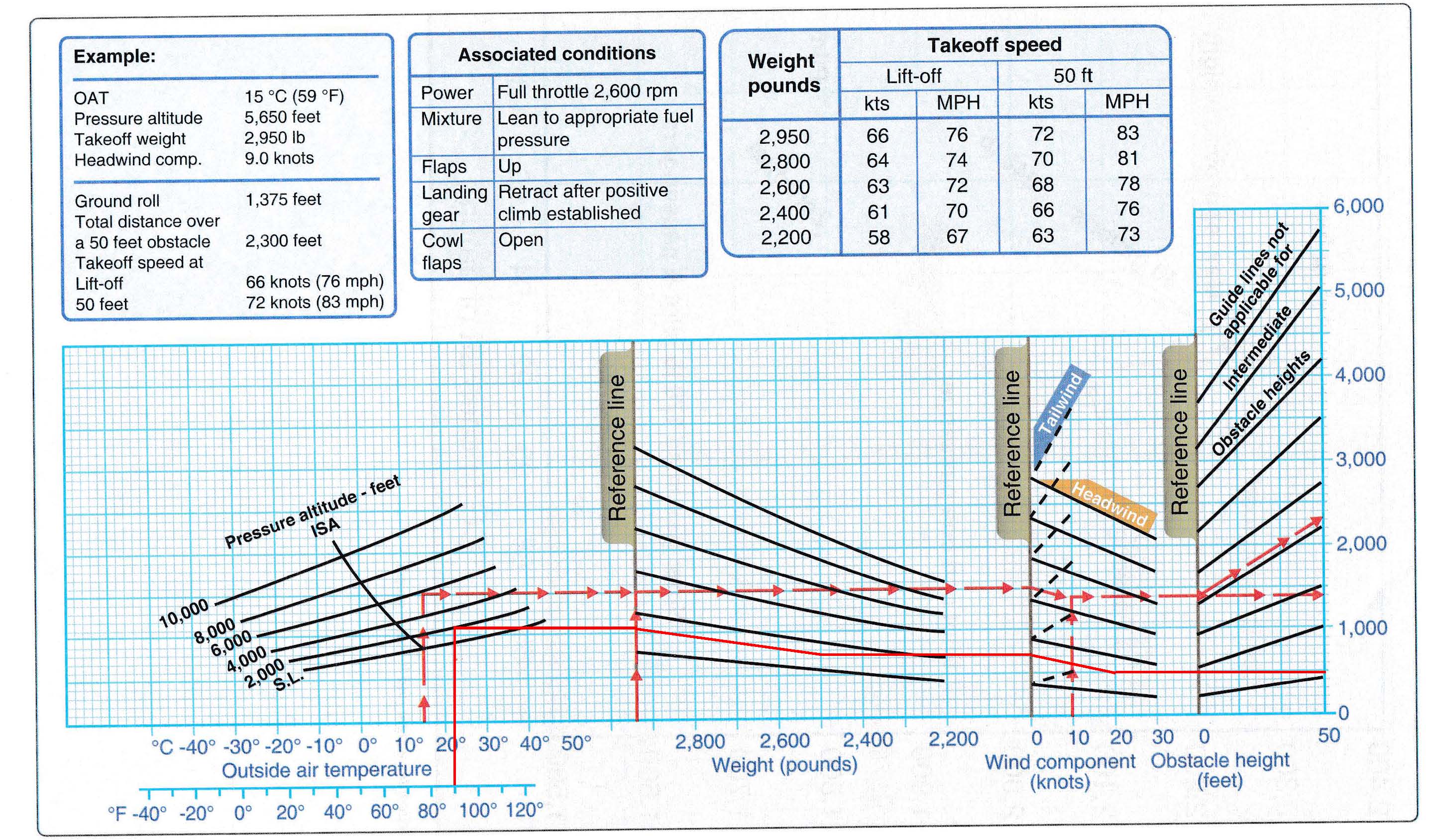
I am trying to solve a numerical problem related to determining take-off roll using a take-off distance graph. The parameters are Temp: 90F, Press. alt: 2000ft, wt: 2500lbs, headwind: 20 Knots. I got the following graph (solid red lines):

enter image description here

My questions/clarifications are as follows:

  1. It looks like the first reference line is the "density altitude", correct?
  2. Looks like the second section of the graph is a relationship between aircraft weight and take-off roll (where take-off roll distances are represented vertically on the second reference) at various density altitudes. This seems to make sense because for a certain weight, if I go up, meaning I intercept higher density altitudes, the take-off roll increases.
  3. It is not very clear to me the plotting of the diagonal lines. The way I understood it is that they go from the point of interception of the reference line to a point on the vertical weight line which is midway between the inclined curves intercepting that vertical weight line.
$\endgroup$

1 Answer 1

7
$\begingroup$

You need to read such graphs strictly from left to right. Each new panel adds the influence of another parameter, and when you are done, the result is corrected for altitude, take-off weight, wind and obstacle height. Except for the leftmost panel, the groups of lines only help you to find the correct slope and do not represent a certain altitude.

You start with the outside air temperature. Pick what the instrument in your cockpit indicates, and go from the temperature axis straight up until you intercept the line which is closest to your given pressure altitude. This can be read directly from the altimeter if it is set correctly. You can try to interpolate between lines, but to be safe pick the next higher value.

Next, move horizontally to the first reference line. From there, follow the slope of the lines until you intercept the x-position which corresponds to your aircraft's mass. If you start between two lines, you should move such that the relative vertical distance to the neighboring lines does not change. Note that the take-off mass is also a value you should know already if your preflight was done properly.

From that point, jump off horizontally until you intercept the next reference line. Depending on wind direction, follow either the dashed or the solid lines until you arrive at the x-position which corresponds to the wind component in runway direction. You will note that for headwind you will move slightly down, so headwind shortens the take-off distance. Makes sense, right?

The last panel helps you to find both the take-off roll (obstacle height zero) and the take-off distance over a 50 ft obstacle. Here you can only extract the values at the x-positions 0 and 50 and interpolation will not work. The y-axis all the way on the right now will tell you the distances in feet.

The reference lines show the values for the standard take-off at MTOW and calm wind. The examples given by the red lines are for two different situations:

  1. Solid red line: OAT is 90°F, pressure altitude is 2000ft MSL, take-off mass is 2500lbs and with a headwind of 20kts the take-off roll is 500ft. At this point your speed should be 62kts (see table). This is the result for your first question.
  2. Dashed red line: OAT is 15°C, pressure altitude is 6000ft MSL (rounded up from 5650ft), take-off mass is 2950lbs and with a headwind of 9kts your take-off roll is 1400ft and the distance needed to clear the 50ft obstacle at 1.3*stall speed is 2300ft.
$\endgroup$
5
  • 2
    $\begingroup$ Why to the Fahrenheit and Celsius scales on the left-hand graph not line up properly? It seems to show 0°C = 50°F. $\endgroup$
    – FreeMan
    Commented Mar 9, 2015 at 12:28
  • $\begingroup$ Peter, Thanks for your reply. Very good info. Some follow up questions. I still am finding it hard to understand how to plot the diagonal or inclined plots (the part you discuss in your third pararaph). You say "follow the slope of the lines", does this mean stay parallel to either or both lines? This is not very clear to me. $\endgroup$
    – yankeemike
    Commented Mar 9, 2015 at 13:54
  • $\begingroup$ It means you should maintain at the same position relative to the two lines. If you start in the middle, you should stay halfway between the two lines. Basically, it's a visual way of interpolating between the two lines. $\endgroup$
    – ROIMaison
    Commented Mar 9, 2015 at 14:07
  • $\begingroup$ The diagram is a sample from the FAA Airman Knowledge Testing Supplment (page 40). The Fahrenheit/Celsius scale error was a known issue and has been corrected in current versions, including the one I linked to. $\endgroup$
    – Brian
    Commented Mar 9, 2015 at 17:13
  • $\begingroup$ And for the original poster, I should add that the graph is also used in chapter 10 of the Pilot's Handbook of Aeronautical Knowledge, including a detailed description of why and how to use the chart and sample problems. $\endgroup$
    – Brian
    Commented Mar 9, 2015 at 17:20

You must log in to answer this question.

Not the answer you're looking for? Browse other questions tagged .