1
$\begingroup$

I am looking for a script or tool to create flight test and/or FDR plots with several vertical axis, such as the ones used in aircraft accident investigations.

Does anyone have any hint on a MATLAB or Python script that does it? I have the data and I know how to code, just didn't want to reinvent the wheel here.

Example:
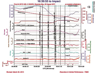
Source

$\endgroup$
6
  • $\begingroup$ Welcome to Aviation.SE. I'll wait for the opinion of the other members, but I am afraid your question might not be on topic here. You are not properly asking an aviation question here, but only how to make a specific plot in Matlab/Python/whatever $\endgroup$
    – Federico
    Commented Feb 15, 2018 at 14:34
  • $\begingroup$ Hi Federico! I thought that someone that works in the aircraft industry (just like me) would have already created a script for such objective. I am afraid a Python or MATLAB programmer/enthusiast would hardly have access for flight data to play with. $\endgroup$
    – Lander
    Commented Feb 15, 2018 at 14:46
  • $\begingroup$ I see your point, and that's why I did not immediately hammer your post down. The problem is that from a quality point of view, this question is little more than "please give me the code/solution" that is a bit frowned upon around stackechange. Should the others agree with you, no problem. If instead they should vote to close this question, stick around, gain a bit of reputation, and pass by chat! $\endgroup$
    – Federico
    Commented Feb 15, 2018 at 14:52
  • $\begingroup$ Do you have raw data taken directly from say a QAR or test telemetry/recording device, or processed data that's already converted to engineering units and standard sign conventions? (an example of the latter is "climbing right turns are positive", which is what the NTSB uses for all their FDR plotting) $\endgroup$ Commented Feb 16, 2018 at 3:23
  • $\begingroup$ In fact I have both raw and engineering units data. $\endgroup$
    – Lander
    Commented Feb 16, 2018 at 9:48

1 Answer 1

2
$\begingroup$

I don't think these plots are generated from Matlab or Python, but from special-purpose software. This was discussed in chat a couple of months ago, and one example is Insight Analysis, which offers a GUI interface to put together the kind of chart you're looking for. It's definitely not the only such tool, though.

$\endgroup$

You must log in to answer this question.

Not the answer you're looking for? Browse other questions tagged .