added 510 characters in body
Source Link
mins
  • 80.9k
  • 30
  • 326
  • 473

In short

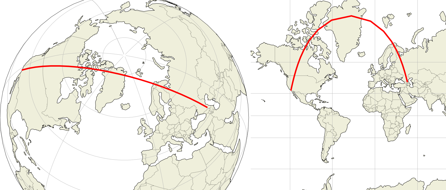
This is counterintuitive. Ignoring Earth curvature not shown on maps, the routes which appear curved on the screenshots are actually nearly straight. Compare these two different projections:

Aircraft routes may notGreat circle diagram on sphere and on Mercator map

This is the same track, the same geographic landmarks are crossed. Still:

  • Left: We sense a bulging disk, the path is nearly parallel to two opposite meridians forming a circle, it must be a straight path.

  • Right: The path doesn't seem parallel to any meridian and we can't make sense of the heading change over Greenland. Difficult to see a straight path here.

Websites don't use the azimuthal projection of the left side because the map must be strictly straight (shortestdrawn with the path), but they try close to be. The reasonthe center, while Mercator projection is unique for the whole Earth. But there is a growing demand for an adaptive map representation, adjusting the projection while zooming in/out. With current server and client processing capabilities this is possible, see this demonstration.

Commercial routes are constraintsas straight as possible, deviations are due to be taken into accountconstraints, e.g. the maximum distance ofto available emergency airports, or the avoidance ofweather/conflict unsafe areas. But above that, crews avoid storms and often fly in areas of favorableunfavorable winds to reduce both trip time and fuel burnt. Winds found at cruise altitudes are commonly about 200 km/h.

Still the curves you show greatly distort actual routes, due to the map projection used to convert the 3D spherical surface into a flat surfaceDetails follow.


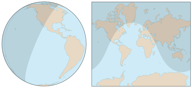
In 3D, a "straight path" on a sphere is a circle arccurve. Our brain is able to identify such circle as a straight linecurve "as straight" on azimuthal projections, exceptbut on someother types of map projection, specially on Mercator maps used to depict large areas, such equivalence makes no sense. Example with azimuthal projection on the left and web Mercator on the right:

The map on the left projects the sphere on a disk (azimuthal projection), on the right it projects it on a rectangle (web Mercator projection). The shadow represents the night, and of course the separation between night and day is a circle (i.e., a straight path for an aircraft). This circle is easily identified onIt's not difficult to accept the azimuthal projection. The same circleidea the path is visible onstraight the Mercator projectionleft, but to be convincedon the right, it's nearly impossible. However looking closer, we need to look atsee the locations crossed and confirm they are indeedpath crosses the same landmarks.

The map on the right side is representative of maps used on websites, a Mercator projection using a cylinder tangent atto the equator:

The only places the map is accurate is along the equator. At any other latitude, it is distorted, the distortion increasesincreasing as we get closer to the poles. It's nonsense near the poles where the meridians never converge, giving Greenland (2 million km²) the size of Africa (30 million km²).

To limitOn the distortionimage above, the polar regionsfeatures are not projected and the projection doesn't usealong straight lines as shown above. Straight lines correspondLatitude $\small \phi$ corresponds to amap vertical position computed ascoordinate $\small y(\phi)=r \tan \phi$, but the. Mercator projection actually uses Mercator'sMercator function, equivalent to $\small y(\phi)=r \ln(\tan(\pi/4+\phi/2))$, in order to make it conformal, the goal Mercator was actually seeking after to make ship navigation easier. The aberrant polar regions are never shown.

  • Greenland, 2 million km², looks the same size as Africa, 30 million km² (seesee the True Size of Countries to understand how much this is wrong).

  • All great circles except for the equator and meridians are curved, more strongly at higher latitudes.

  • The heading is actually constant, but near the pole, the straight line (great circle) seems to make a U-turn. This is the most counterintuitive aspect.

  • The flat distance for LA-Grozny on the web Mercator projection (EPSG:3857) is 18,300 km, but the real ellipsoidal distance (on WGS 84 ellipsoid) is only about 11,300 km.

This is counterintuitive. Ignoring Earth curvature not shown on maps, the routes which appear curved on the screenshots are actually nearly straight.

Aircraft routes may not be strictly straight (shortest path), but they try to be. The reason is there are constraints to be taken into account, e.g. the distance of emergency airports, or the avoidance of unsafe areas. But above that, crews avoid storms and often fly in areas of favorable winds to reduce both trip time and fuel burnt. Winds found at cruise altitudes are commonly about 200 km/h.

Still the curves you show greatly distort actual routes, due to the map projection used to convert the 3D spherical surface into a flat surface.

In 3D, a "straight path" on a sphere is a circle arc. Our brain is able to identify such circle as a straight line, except on some types of map projection, specially on Mercator maps used to depict large areas. Example:

The map on the left projects the sphere on a disk (azimuthal projection), on the right it projects it on a rectangle (web Mercator projection). The shadow represents the night, and of course the separation between night and day is a circle (i.e. a straight path for an aircraft). This circle is easily identified on the azimuthal projection. The same circle is visible on the Mercator projection, but to be convinced, we need to look at the locations crossed and confirm they are indeed the same.

The map on the right side is representative of maps used on websites, a Mercator projection using a cylinder tangent at the equator:

The only places the map is accurate is along the equator. At any other latitude, it is distorted, the distortion increases as we get closer to the poles. It's nonsense near the poles where the meridians never converge, giving Greenland (2 million km²) the size of Africa (30 million km²).

To limit the distortion, the polar regions are not projected and the projection doesn't use straight lines as shown above. Straight lines correspond to a vertical position computed as $\small y(\phi)=r \tan \phi$, but the projection actually uses Mercator's function, equivalent to $\small y(\phi)=r \ln(\tan(\pi/4+\phi/2))$, in order to make it conformal.

  • Greenland, 2 million km², looks the same size as Africa, 30 million km² (see the True Size of Countries to understand how much this is wrong).

  • All great circles except for the equator and meridians are curved, more strongly at higher latitudes.

  • The heading is actually constant, but near the pole, the straight line (great circle) seems to make a U-turn. This is the most counterintuitive aspect.

  • The flat distance for LA-Grozny on the web Mercator projection (EPSG:3857) is 18,300 km, but the real ellipsoidal distance (on WGS 84 ellipsoid) is only about 11,300 km.
In short

This is counterintuitive. Ignoring Earth curvature not shown on maps, the routes which appear curved on the screenshots are actually nearly straight. Compare these two different projections:

Great circle diagram on sphere and on Mercator map

This is the same track, the same geographic landmarks are crossed. Still:

  • Left: We sense a bulging disk, the path is nearly parallel to two opposite meridians forming a circle, it must be a straight path.

  • Right: The path doesn't seem parallel to any meridian and we can't make sense of the heading change over Greenland. Difficult to see a straight path here.

Websites don't use the azimuthal projection of the left side because the map must be drawn with the path close to the center, while Mercator projection is unique for the whole Earth. But there is a growing demand for an adaptive map representation, adjusting the projection while zooming in/out. With current server and client processing capabilities this is possible, see this demonstration.

Commercial routes are as straight as possible, deviations are due to constraints, e.g. the maximum distance to available emergency airports, weather/conflict unsafe areas and unfavorable winds.

Details follow.


In 3D, a "straight path" on a sphere is a curve. Our brain is able to identify such curve "as straight" on azimuthal projections, but on other types of map projection, specially on Mercator maps, such equivalence makes no sense. Example with azimuthal projection on the left and web Mercator on the right:

The shadow represents the night, and of course the separation between night and day is a circle, a straight path for an aircraft. It's not difficult to accept the idea the path is straight the left, but on the right, it's nearly impossible. However looking closer, we see the path crosses the same landmarks.

The map on the right side is representative of maps used on websites, a Mercator projection using a cylinder tangent to the equator:

The only places the map is accurate is along the equator. At any other latitude, it is distorted, the distortion increasing as we get closer to the poles. It's nonsense near the poles where the meridians never converge, giving Greenland (2 million km²) the size of Africa (30 million km²).

On the image above, features are projected along straight lines. Latitude $\small \phi$ corresponds to map vertical coordinate $\small y(\phi)=r \tan \phi$. Mercator projection actually uses Mercator function, equivalent to $\small y(\phi)=r \ln(\tan(\pi/4+\phi/2))$, in order to make it conformal, the goal Mercator was actually seeking after to make ship navigation easier. The aberrant polar regions are never shown.

  • Greenland looks the same size as Africa, see the True Size of Countries to understand how much this is wrong.

  • All great circles except for the equator and meridians are curved, more strongly at higher latitudes.

  • The heading is actually constant, but near the pole, the straight line (great circle) seems to make a U-turn. This is the most counterintuitive aspect.

  • The flat distance for LA-Grozny on the web Mercator projection (EPSG:3857) is 18,300 km, but the real ellipsoidal distance (on WGS 84 ellipsoid) is only about 11,300 km.
deleted 323 characters in body
Source Link
mins
  • 80.9k
  • 30
  • 326
  • 473

To limit the distortion, the polar regions are not projected and the projection doesn't use straight lines as shown above. Straight lines correspond to a vertical position computed as $\small y(\phi)=r \tan \phi$, but the projection actually uses Mercator's function, equivalent to $\small y(\phi)=r \ln(\tan(\pi/4+\phi/2))$, in order to make it conformal.

To limit the distortion, the polar regions are not projected and the projection doesn't use straight lines as shown above. Straight lines correspond to a vertical position computed as $\small y(\phi)=r \tan \phi$, but the projection actually uses Mercator's function, equivalent to $\small y(\phi)=r \ln(\tan(\pi/4+\phi/2))$.

To limit the distortion, the polar regions are not projected and the projection doesn't use straight lines as shown above. Straight lines correspond to a vertical position computed as $\small y(\phi)=r \tan \phi$, but the projection actually uses Mercator's function, equivalent to $\small y(\phi)=r \ln(\tan(\pi/4+\phi/2))$, in order to make it conformal.

deleted 323 characters in body
Source Link
mins
  • 80.9k
  • 30
  • 326
  • 473

Short answer

The This is counterintuitive. Ignoring Earth curvature not shown on maps, the routes which appear curved on the screenshots are actually mostlynearly straight, if we ignore Earth curvature which is not represented on maps.

It's true aircraftAircraft routes aremay not always the shortest pathsbe strictly straight (shortest path), because other considerations count toobut they try to be. The reason is there are constraints to be taken into account, e.g. the possibility of landing in casedistance of a problememergency airports, or the avoidance of unsafe areas, etc, though weather and wind are the prime parameters. Weather for safetyBut above that, crews avoid storms and wind for profitabilityoften fly in areas of favorable winds to reduce both trip time and fuel burnt. Winds found at cruise altitudes are commonly about 200 km/h, this influences both fuel and time required for the flight.

Still the curves you show greatly exaggerate the curvature ofdistort actual routes. This problem is a known, due to the map projection issue when convertingused to convert the 3D spherical surface into a 2D flat representationsurface.

AMercator maps

In 3D, a "straight path" is actuallyon a portion ofsphere is a circle due to Earth sphericityarc. Our brain is usually able to identify asuch circle whatever the perspective. However most mapsas a straight line, except on some types of map projection, specially webon Mercator maps, due to their need used to showdepict large areas, use projections our brain cannot compensate easily for. For exampleExample:

enter image description here

The map on the left projects the sphere on a disk (azimuthal projection), on the image belowright it projects it on a rectangle (web Mercator projection). The shadow represents the night, and of course the line separatingseparation between night and day is a circle (i.e. a straight path for an aircraft). This circle is easily identified on the left side map, but would you identify the azimuthal projection. The same circle is visible on the right side map?

enter image description hereMercator projection, but to be convinced, we need to look at the locations crossed and confirm they are indeed the same.

The map on the right hand imageside is a web Mercator model, representative of maps used on websites. The Mercator projection is, a Mercator projection onusing a cylinder tangent at the equator:

So theThe only placeplaces the map is accurate is atalong the equator. AsAt any other latitude increases, it is distorted, the distortion increases tooas we get closer to the poles. It's nonsense near the poles where the meridians never converge, giving Greenland (2 million km²) the size of Africa (30 million km²).

To limit the distortion, the polar regions are not projected and the projection doesn't use straight lines as shown above. Straight lines correspond to a vertical position computed as $\small y(\phi)=r \tan \phi$, but the projection actually uses Mercator's function, equivalent to $\small y(\phi)=r \ln(\tan(\pi/4+\phi/2))$.

DetailsYour maps: Los Angeles to Grozny and Dubai

  1. What we call straight path is a great circle.

  2. Most maps don't show a great circle as a straight line. Below is a portion of the great circle from Los Angeles to Grozny, which is approximately the route shown on your last screenshot:

    Great circle diagram on sphere and on Mercator map

    On the right hand the Mercator map shows it curved. This is the kind of map used by flight tracking sites. Note how parallels and meridians, which are circles, have been converted into straight lines on the Mercator projection. This conversion comes at the cost of distortions:

Below is a portion of the great circle from Los Angeles to Grozny, which is approximately the route shown on your last screenshot:

Great circle diagram on sphere and on Mercator map

On the right, the Mercator map shows it curved. Parallels and meridians are circles, note how they have been converted into straight lines. This conversion introduces large distortions:

  • Greenland, 2 million km², looks the same size thanas Africa, 30 million km². See (see the True Size of Countries to understand how much our North/South evaluation of the Worldthis is biased by Mercator mapswrong).

  • All great circles except for the equator and meridians are curved, more strongly at higher latitudes.

  • If the route overflewThe heading is actually constant, but near the pole, then there would bethe straight line (great circle) seems to make a horizontal segment which length would be halfU-turn. This is the map width, but representing no physical offset!most counterintuitive aspect.

  • The flat distance for LA-Grozny on the web Mercator projection (EPSG:3857) is 18,300 km, but the real ellipsoidal distance (on WGS 84 ellipsoid) is only about 11,300 km.

    This is too much to compensate for, we're not trained for than.

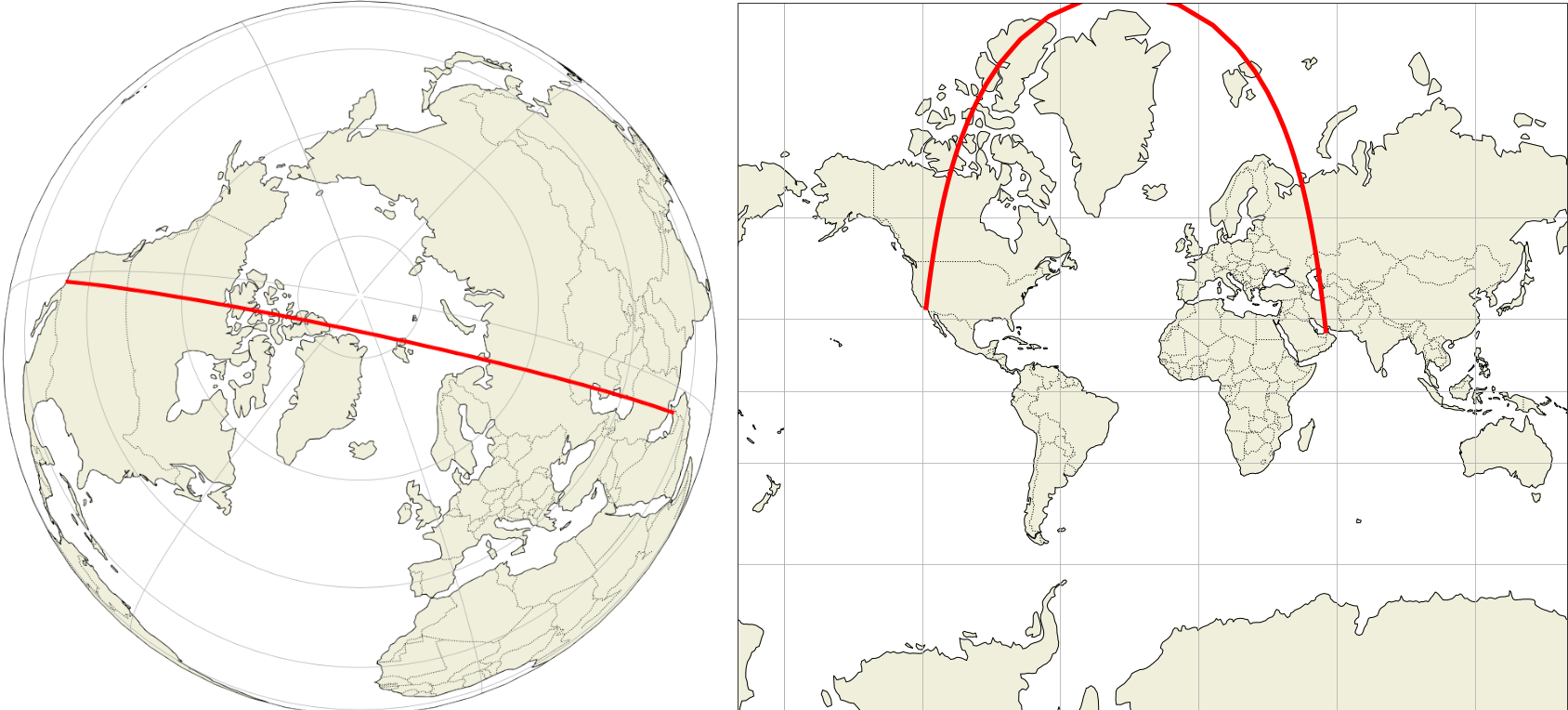
    The flight on your last screenshot (UAE37V) was ultimately heading to Dubai. The shortest path would have put it further North than the path it actually used. This is the great circle from LA to Dubai:

    Diagram showing route on sphere and on Mercator projection map

    Great circle from LA to Dubai, the shortest route for UAE37V

    The projection problem is manifest: the aircraft is following the 120°W meridian then the 60°E meridian. These meridians are (180°) opposite on the globe and form a continuous circle. However, on the Mercator map, this circle is folded at the pole and the two meridians are made parallel lines. So the aircraft seems to turn near the pole, while it actually continues flying straight ahead.

  1. Most flights take advantage of winds. On routes in the Northern hemisphere there are strong winds from West to East at cruise altitude, known as jet streams. Today's jet streams, from Null Earth:

    Image showing jet stream speeds around Earth using colours

    So flights going eastward change their route to join these winds, and flights going westward will avoid them. This has been already explained in:

    Why are westbound transatlantic routes located hundreds of km away from eastbound routes?

    Aircraft crossing the North Atlantic use predetermined tracks which are based on the location of current jet streams, recalculated twice a day. So two of the same flights may not use the same route, just because the North Atlantic tracks have moved.

This is too much to compensate for, we're not trained for than.

The flight on your last screenshot (UAE37V) was ultimately heading to Dubai. The shortest path would have put it further North than the path it actually used. This is the great circle from LA to Dubai:

Diagram showing route on sphere and on Mercator projection map

Great circle from LA to Dubai, the shortest route for UAE37V

The projection problem is manifest: the aircraft is following the 120°W meridian then the 60°E meridian. These meridians are (180°) opposite on the globe and form a continuous circle. However, on the Mercator map, this circle is folded at the pole and the two meridians are made parallel lines. So the aircraft seems to turn near the pole, while it actually continues flying straight ahead.

Short answer

The routes on the screenshots are actually mostly straight, if we ignore Earth curvature which is not represented on maps.

It's true aircraft routes are not always the shortest paths, because other considerations count too, e.g. the possibility of landing in case of a problem, unsafe areas, etc, though weather and wind are the prime parameters. Weather for safety, and wind for profitability. Winds found at cruise altitudes are commonly about 200 km/h, this influences both fuel and time required for the flight.

Still the curves you show greatly exaggerate the curvature of actual routes. This problem is a known map projection issue when converting the 3D spherical surface into a 2D flat representation.

A "straight path" is actually a portion of a circle due to Earth sphericity. Our brain is usually able to identify a circle whatever the perspective. However most maps, specially web maps, due to their need to show large areas, use projections our brain cannot compensate easily for. For example, on the image below, the line separating night and day is a circle easily identified on the left side map, but would you identify the same circle on the right side map?

enter image description here

The right hand image is a web Mercator model, representative of maps used on websites. The Mercator projection is a projection on a cylinder tangent at the equator:

So the only place the map is accurate is at the equator. As latitude increases, distortion increases too. It's nonsense near the poles where the meridians never converge, giving Greenland (2 million km²) the size of Africa (30 million km²).

Details

  1. What we call straight path is a great circle.

  2. Most maps don't show a great circle as a straight line. Below is a portion of the great circle from Los Angeles to Grozny, which is approximately the route shown on your last screenshot:

    Great circle diagram on sphere and on Mercator map

    On the right hand the Mercator map shows it curved. This is the kind of map used by flight tracking sites. Note how parallels and meridians, which are circles, have been converted into straight lines on the Mercator projection. This conversion comes at the cost of distortions:

  • Greenland, 2 million km², looks the same size than Africa, 30 km². See the True Size of Countries to understand how much our North/South evaluation of the World is biased by Mercator maps.

  • All great circles except for the equator and meridians are curved, more strongly at higher latitudes.

  • If the route overflew the pole, then there would be a horizontal segment which length would be half the map width, but representing no physical offset!

  • The flat distance for LA-Grozny on the web Mercator projection (EPSG:3857) is 18,300 km, but the real ellipsoidal distance (on WGS 84 ellipsoid) is only about 11,300 km.

    This is too much to compensate for, we're not trained for than.

    The flight on your last screenshot (UAE37V) was ultimately heading to Dubai. The shortest path would have put it further North than the path it actually used. This is the great circle from LA to Dubai:

    Diagram showing route on sphere and on Mercator projection map

    Great circle from LA to Dubai, the shortest route for UAE37V

    The projection problem is manifest: the aircraft is following the 120°W meridian then the 60°E meridian. These meridians are (180°) opposite on the globe and form a continuous circle. However, on the Mercator map, this circle is folded at the pole and the two meridians are made parallel lines. So the aircraft seems to turn near the pole, while it actually continues flying straight ahead.

  1. Most flights take advantage of winds. On routes in the Northern hemisphere there are strong winds from West to East at cruise altitude, known as jet streams. Today's jet streams, from Null Earth:

    Image showing jet stream speeds around Earth using colours

    So flights going eastward change their route to join these winds, and flights going westward will avoid them. This has been already explained in:

    Why are westbound transatlantic routes located hundreds of km away from eastbound routes?

    Aircraft crossing the North Atlantic use predetermined tracks which are based on the location of current jet streams, recalculated twice a day. So two of the same flights may not use the same route, just because the North Atlantic tracks have moved.

This is counterintuitive. Ignoring Earth curvature not shown on maps, the routes which appear curved on the screenshots are actually nearly straight.

Aircraft routes may not be strictly straight (shortest path), but they try to be. The reason is there are constraints to be taken into account, e.g. the distance of emergency airports, or the avoidance of unsafe areas. But above that, crews avoid storms and often fly in areas of favorable winds to reduce both trip time and fuel burnt. Winds found at cruise altitudes are commonly about 200 km/h.

Still the curves you show greatly distort actual routes, due to the map projection used to convert the 3D spherical surface into a flat surface.

Mercator maps

In 3D, a "straight path" on a sphere is a circle arc. Our brain is able to identify such circle as a straight line, except on some types of map projection, specially on Mercator maps used to depict large areas. Example:

enter image description here

The map on the left projects the sphere on a disk (azimuthal projection), on the right it projects it on a rectangle (web Mercator projection). The shadow represents the night, and of course the separation between night and day is a circle (i.e. a straight path for an aircraft). This circle is easily identified on the azimuthal projection. The same circle is visible on the Mercator projection, but to be convinced, we need to look at the locations crossed and confirm they are indeed the same.

The map on the right side is representative of maps used on websites, a Mercator projection using a cylinder tangent at the equator:

The only places the map is accurate is along the equator. At any other latitude, it is distorted, the distortion increases as we get closer to the poles. It's nonsense near the poles where the meridians never converge, giving Greenland (2 million km²) the size of Africa (30 million km²).

To limit the distortion, the polar regions are not projected and the projection doesn't use straight lines as shown above. Straight lines correspond to a vertical position computed as $\small y(\phi)=r \tan \phi$, but the projection actually uses Mercator's function, equivalent to $\small y(\phi)=r \ln(\tan(\pi/4+\phi/2))$.

Your maps: Los Angeles to Grozny and Dubai

Below is a portion of the great circle from Los Angeles to Grozny, which is approximately the route shown on your last screenshot:

Great circle diagram on sphere and on Mercator map

On the right, the Mercator map shows it curved. Parallels and meridians are circles, note how they have been converted into straight lines. This conversion introduces large distortions:

  • Greenland, 2 million km², looks the same size as Africa, 30 million km² (see the True Size of Countries to understand how much this is wrong).

  • All great circles except for the equator and meridians are curved, more strongly at higher latitudes.

  • The heading is actually constant, but near the pole, the straight line (great circle) seems to make a U-turn. This is the most counterintuitive aspect.

  • The flat distance for LA-Grozny on the web Mercator projection (EPSG:3857) is 18,300 km, but the real ellipsoidal distance (on WGS 84 ellipsoid) is only about 11,300 km.

This is too much to compensate for, we're not trained for than.

The flight on your last screenshot (UAE37V) was ultimately heading to Dubai. The shortest path would have put it further North than the path it actually used. This is the great circle from LA to Dubai:

Diagram showing route on sphere and on Mercator projection map

Great circle from LA to Dubai, the shortest route for UAE37V

The projection problem is manifest: the aircraft is following the 120°W meridian then the 60°E meridian. These meridians are (180°) opposite on the globe and form a continuous circle. However, on the Mercator map, this circle is folded at the pole and the two meridians are made parallel lines. So the aircraft seems to turn near the pole, while it actually continues flying straight ahead.

added 967 characters in body
Source Link
mins
  • 80.9k
  • 30
  • 326
  • 473
Loading
added 967 characters in body
Source Link
mins
  • 80.9k
  • 30
  • 326
  • 473
Loading
added 476 characters in body
Source Link
mins
  • 80.9k
  • 30
  • 326
  • 473
Loading
added 396 characters in body
Source Link
mins
  • 80.9k
  • 30
  • 326
  • 473
Loading
added 396 characters in body
Source Link
mins
  • 80.9k
  • 30
  • 326
  • 473
Loading
added 5 characters in body
Source Link
mins
  • 80.9k
  • 30
  • 326
  • 473
Loading
added 5 characters in body
Source Link
mins
  • 80.9k
  • 30
  • 326
  • 473
Loading
added 5 characters in body
Source Link
mins
  • 80.9k
  • 30
  • 326
  • 473
Loading
added 742 characters in body
Source Link
mins
  • 80.9k
  • 30
  • 326
  • 473
Loading
edited body
Source Link
mins
  • 80.9k
  • 30
  • 326
  • 473
Loading
edited body
Source Link
mins
  • 80.9k
  • 30
  • 326
  • 473
Loading
added 437 characters in body
Source Link
mins
  • 80.9k
  • 30
  • 326
  • 473
Loading
added 64 characters in body
Source Link
mins
  • 80.9k
  • 30
  • 326
  • 473
Loading
added 312 characters in body
Source Link
mins
  • 80.9k
  • 30
  • 326
  • 473
Loading
Source Link
mins
  • 80.9k
  • 30
  • 326
  • 473
Loading