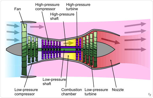
This image (so commonly used here that the first image reference for it that pops up in a Google search for "jet engine diagram" points back to ASE!)

From Wikipedia
Shows the housing of the actual "jet" section very tightly packaged around the various sized compressor and turbine stages, leaving a diverging/converging path for the bypass airflow.
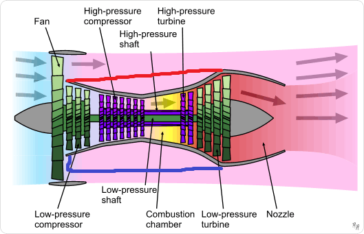
It seems to me that it would make more sense for the packaging of the inner jet engine to be a fairly even cylinder so the bypass air flows smoothly around it and out the back of the nacelle as I've attempted to depict with the blue line at the bottom, or a somewhat converging shape as I've depicted with the red line at the top.

Source: personal modification of above mentioned Wiki picture. Don't laugh... I drew that with my thumb-operated trackball.
However, as I've typed this question up and looked at the diagram more, I can see where the converging path around the low-pressure turbine section of the jet would add additional pressure to the bypass air and, therefore, additional energy to the escaping air.
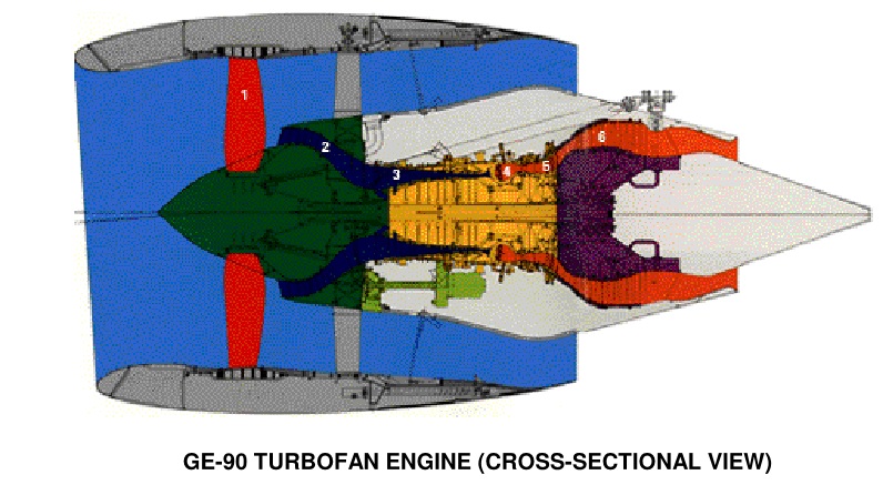
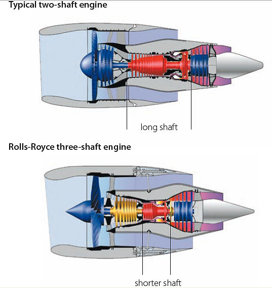
Is this simply an "artist's concept" of a cross-section of a turbofan engine, or is it an accurate depiction of the internals?
Note: I do understand that within the jet section of the engine the shaping needs to be tightly packaged to ensure the jet-internal air flows exactly where it's needed, my question is about the flow of the bypass air only.


