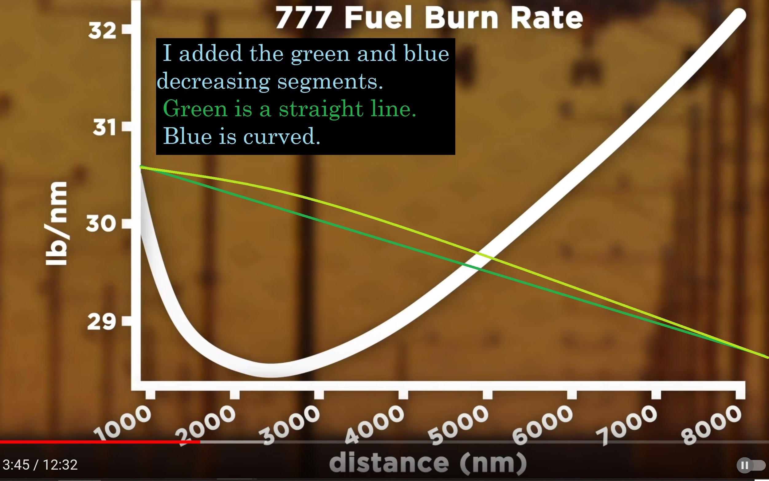
What does the graph show?
The graph plots the average fuel required per distance as a function of the total flight distance. It does not show fuel flow rate as a function of time during the flight.
Why is it going up towards shorter flights?
For short flights (less than ~2500 NM for the 777), the takeoff and climb to cruise altitude are a larger fraction of the total fuel required. Since the aircraft has a higher fuel flow rate during the climb part compared to cruise, this will increase the average fuel per distance figure. The longer the flight gets, the less important is the climb. Therefore, the average fuel per distance is initially decreasing with flight distance.
Why is it going up again for longer flights?
The problem here is that you have to carry the fuel for the entire flight, which makes the aircraft significantly heavier. This is not an issue for short-haul regional airliners, but for long-haul flights the fuel weight can be enormous. E.g., the 777-200LR has a max. fuel capacity of 145 t, which is about equal to its OEW (Operating Empty Weight).
Since the aircraft is now significantly heavier during the initial stage of the flight, it will have a higher fuel flow rate due to the higher weight and due to the lower initial cruise altitude (e.g. optimum cruise altitude for a 777-200LR at a weight of 340 t is only FL285, but after burning 100 t of fuel it has increased to FL360). Long-haul flights will usually perform step climbs to increase their cruise altitude during the flight as their weight decreases. This further reduces the fuel flow rate during the flight, but the average fuel burn for the long-haul flight is still higher.
At what distance this effect starts to dominate over the first one (and average fuel per distance then increases again), depends on the aircraft (and actual payload). For the 777 it seems to be at about 2500 NM.

